In most employee survey work, we work with scales, questions and indices that focus on maximization as the goal.
Employee satisfaction or engagement, for example, are assessed using 1 to 5 or 1 to 7 scales, where 1 = very low on something and 5 or 7 = very high. The goal is to be very high on everything.
But for some constructs, maximization does not make sense. Employee energy at work is one of those; it is an optimization scale. That means being too low is bad, and also being too high is not good. Using a 1 to 10 scale, we ask employees where they are on energy and also where they are most productive.
Important predictors of performance
Our research shows that the gap between those two numbers and high fluctuation in energy over time (standard deviation) are both important determinants (predictors) of performance. Figure 1, below, is a visual of the energy pulse 0 to 10 scale.

The energy pulse metric grew out of a very large scale research project, and it resulted from employee surveys with over 200 questions. It has been validated and used around the globe, in multiple languages and cultures.
Think of the energy at work process much like your body pulse rate when you exercise.
To ideally burn calories, you don’t push your heart rate to its maximum. Instead, you find out what your ideal exertion rate is based on your age, weight, exercise goals, and physical condition. You work out in the target heart rate zone, and then as you get in better shape that target rate increases. But you still never push yourself beyond what is healthy.
The same idea works with employee energy at work.
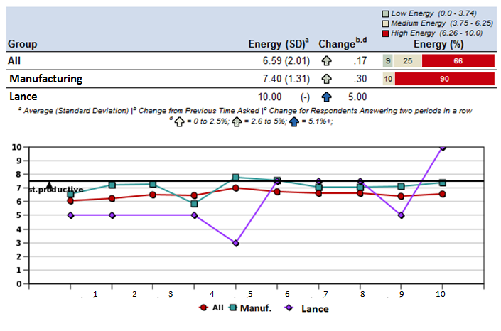
In Figure 2 we are looking at Lance’s data. Lance works in the Manufacturing department in his company. The dark line at about 7.5 is the number where Lance reported he was most productive. The purple line is Lance’s energy score on the dates he took the energy survey.

You can immediately see that something happened in week 10 to send Lance’s energy in a very different direction, above the zone and by quite a few points. There’s a 5 point change in his score from week 9 to week 10.
In the personal reports, Lance keeps a record of what has been making his energy go up and down. Through monitoring his own energy and the factors that drive it, Lance, like anyone who exercises, has visibility over the key drivers of his own energy at work.
In focus groups with employees using the optimization self reporting, we find that there is tremendous learning and subsequent changes in habits at work. Managers have been asking employees to look at their energy trends and talk, generally, to the manager about what’s making their energy go up and down.
Energy data: a robust performance measure
This process is very similar to what is done in the world of total quality management. We learn to minimize variance around a level that keeps a machine producing at an optimal level. We don’t crank up a new piece of equipment to its maximum and hope things don’t break. We find out what the range is where the machine can output at a productive level, keep it in the zone, and we do preventive maintenance.
One might say that we treat machines better than we treat our employees. The question we must ask is how many other employee metrics should be examined through an optimization lens. As we do this, we can focus and perhaps make our methods faster and easier to use.
The only reason we can collect energy data as frequently as weekly, fortnightly, and monthly is because it is simple. The measure is robust; it predicts 360 ratings of performance, patient satisfaction in hospitals, customer satisfaction in the service industry, productivity in manufacturing, and overall scores on big surveys such as “best place to work” assessments.
Even though only two questions are asked — what’s your energy and where are you most productive? — there are sophisticated analyses in the background examining what the right optimization zone is, and this work is based on the links with real performance, using control variables, and the right tools.
When managers receive feedback on their groups’ overall energy, they see energy trends and the degree to which the energy score is “in the zone” of productivity. Managers learn about the things that cause employee burnout and optimal productivity by visually seeing, on a regular basis, how their actions affect their employees.
We have noticed two beneficial outcomes. The first is that managers talk to their employees more; they want to understand why the numbers are going up and down. The conversations or dialogue provide employees with feedback as the manager enters into conversations started by the data.
Second, the number where people are most productive often increases. Similar to what happens when you start exercising regularly, through new habits and dialogue with the coach (the manager in this case), employees learn how to work together to better handle change, stress and high energy situations.
Optimization teaches new skills and new habits. Managers are more realistic about their people data, and optimization leads to discussion more than defensiveness because there is no “right answer” — and managers and employees are not always managing “up.”
Editor’s Note: What are the Energy Files? Over 1 million data points on employee energy at work and open-ended comment data on what is making energy increase and decrease. The raw data, the research studies, and case studies make up the Energy Files. To learn more go to www.leadershippulse.com or www.eepulse.com.
